When Alberici Corporation, a major North American construction company, moved to its LEED Platinum corporate headquarters in 2004, two of their subsidiaries—Hillsdale Fabricators and Kienlen Constructors—remained at the Hillsdale, MO office five miles away. KAI’s Architecture and Interior Design teams were recently contracted by Alberici to completely renovate the outdated second floor of the Hillsdale office to provide better workspace for Hillsdale and Kienlen employees.
The office space was riddled with unused space, outdated finishes and no consistent flow. The space also did not adequately represent the company’s brand or expertise, and the employees were dispersed throughout several floors.
“The client requested an open floor plan to consolidate all of their employees onto one floor, with a centralized break room and a refined, industrial design,” said KAI Interior Designer Asha Perez. “Branding for the space was particularly important to the client, who wanted to exhibit their own steel fabrication expertise throughout the new interior.”
KAI’s design team worked closely with Alberici to develop their vision for the space, which included several collaborative design-build, custom-crafted furniture pieces that showcased the client’s skills.
“The design intended to demonstrate, as well as utilize the on-site capabilities of the structural steel fabricators,” said Perez. “We employed other interior design elements to develop that refined industrial design motif while also complimenting the exposed, existing concrete structure that the client desired for the space.”
The inspiration for the materials used in the design came from Alberici themselves. The KAI team walked through the client’s on-site steel fabrication facility and yard to gain inspiration and appreciation for the work that they do. Throughout the yard, they saw heavy steel, steel scraps, machinery and employees at work, which helped the team start to put the schematic design into context.
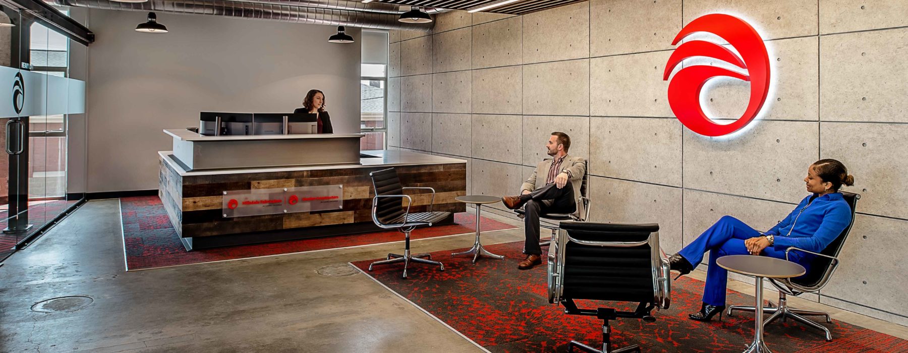
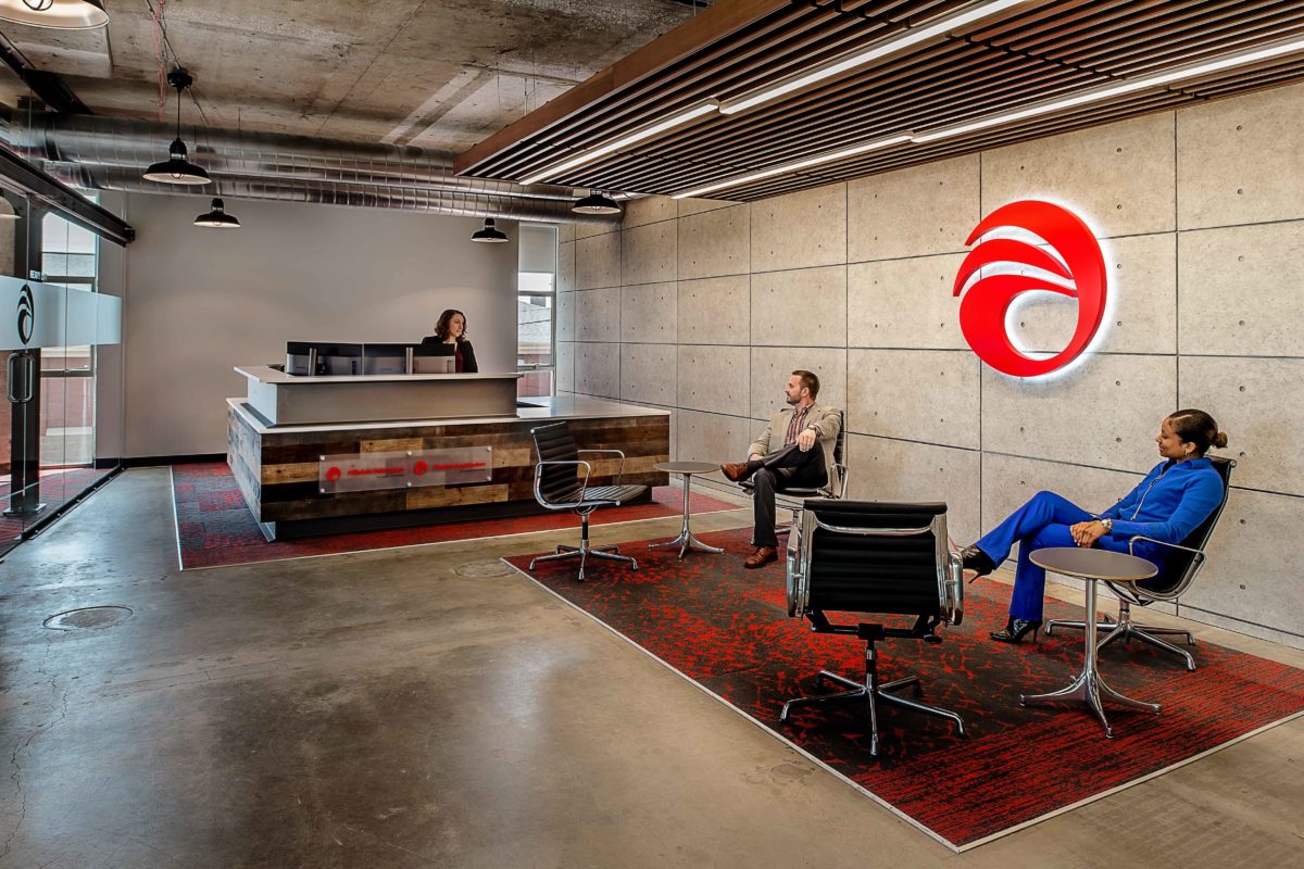
The renovated space features an “unfinished look” with sealed concrete floors and exposed ceilings and columns. Gray tones in the porcelain floor tiles communicate a similar design language, reflecting the warmth of the tones in the concrete throughout. Reclaimed wood was selected for use on the walls to wrap the elevator, while defining that as an alternate interior exit and entry point to and from the first floor. The wood was also used on the reception desk to add more textural interest to the space. The interior façade of the reception area features concrete-look panels with reveals and form-tie details, drawing inspiration from Japanese architect Tadau Ando.
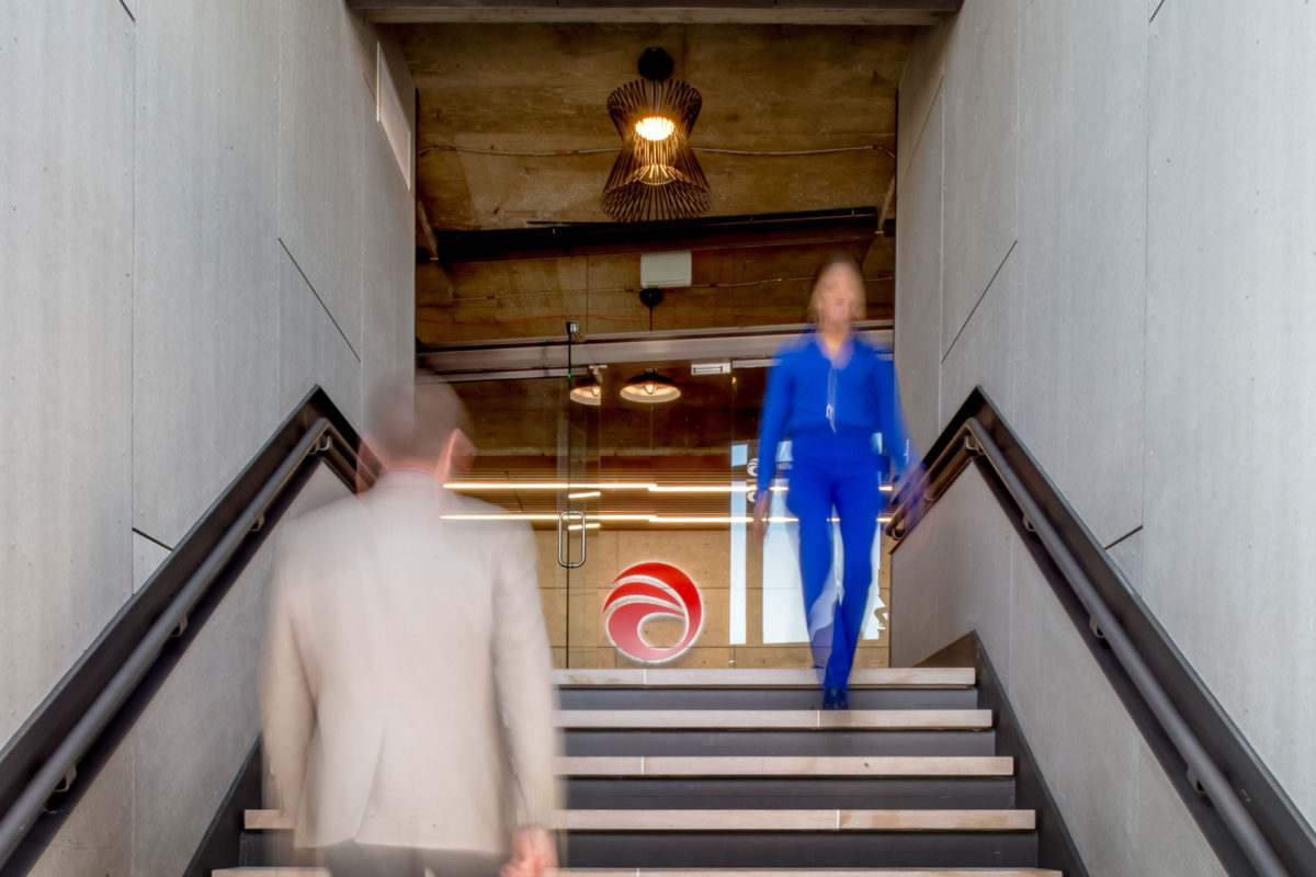
KAI also redesigned the main front entry stairway replacing the existing terrazzo. Minerit heavy duty fiber cement board panels were used on the stairway entry walls. Recessed steel channels were designed for the handrails along each side and returns at the bottom and top of the stair landings. Limestone was used for the stair treads and steel for the risers.
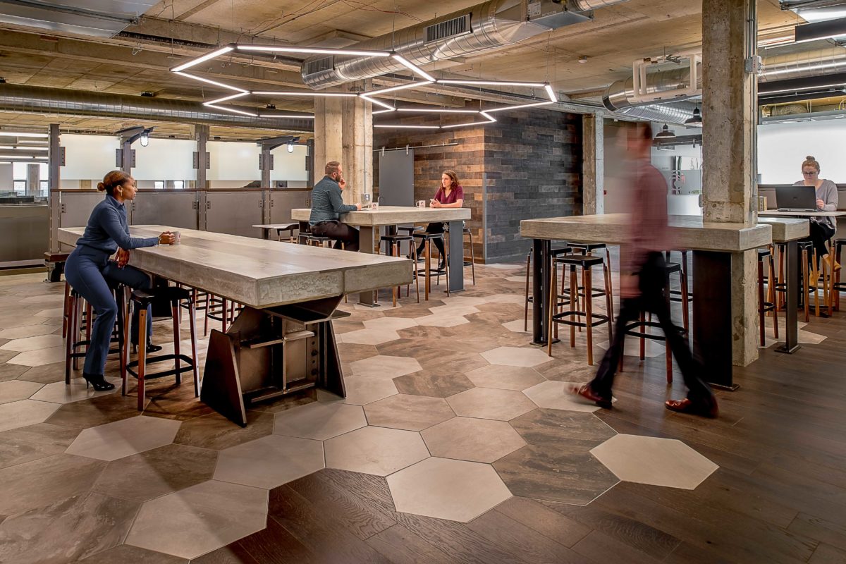
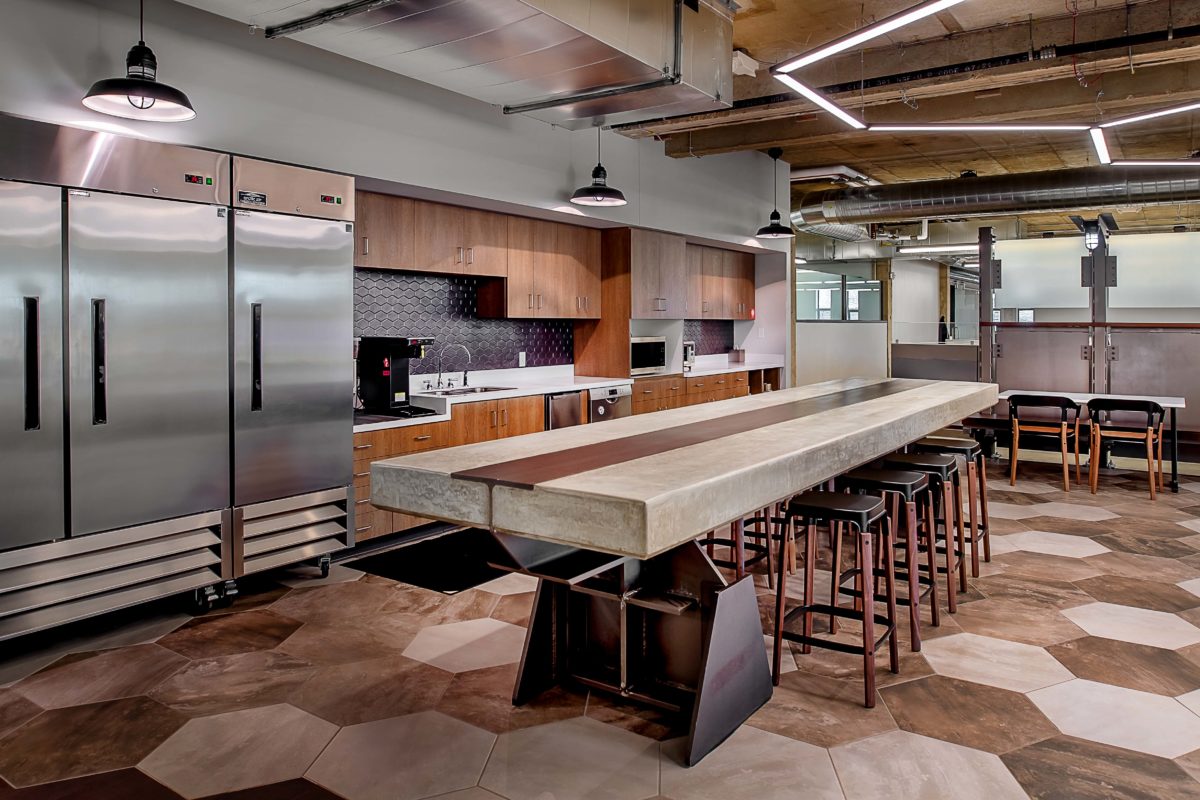
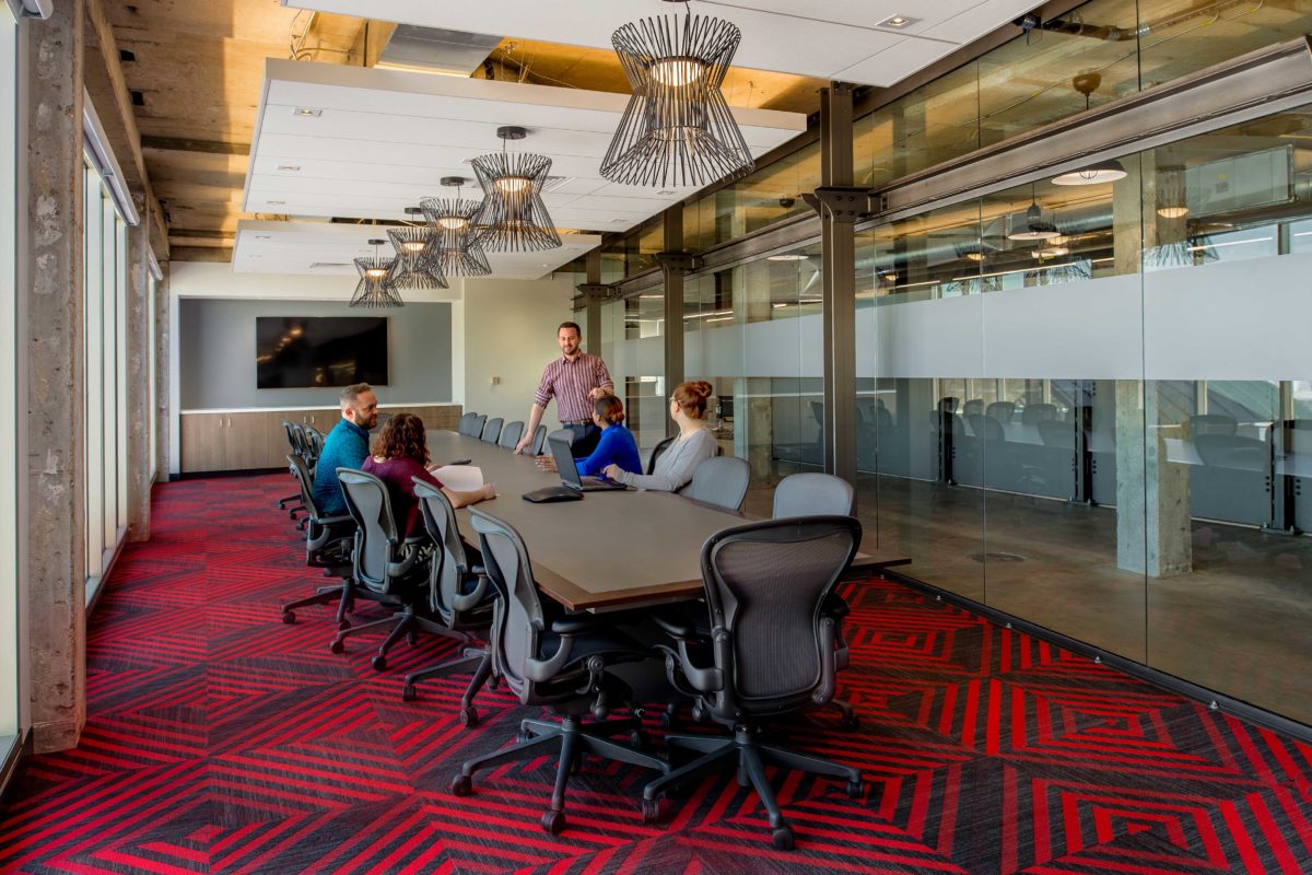
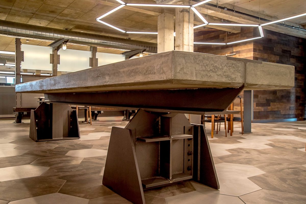
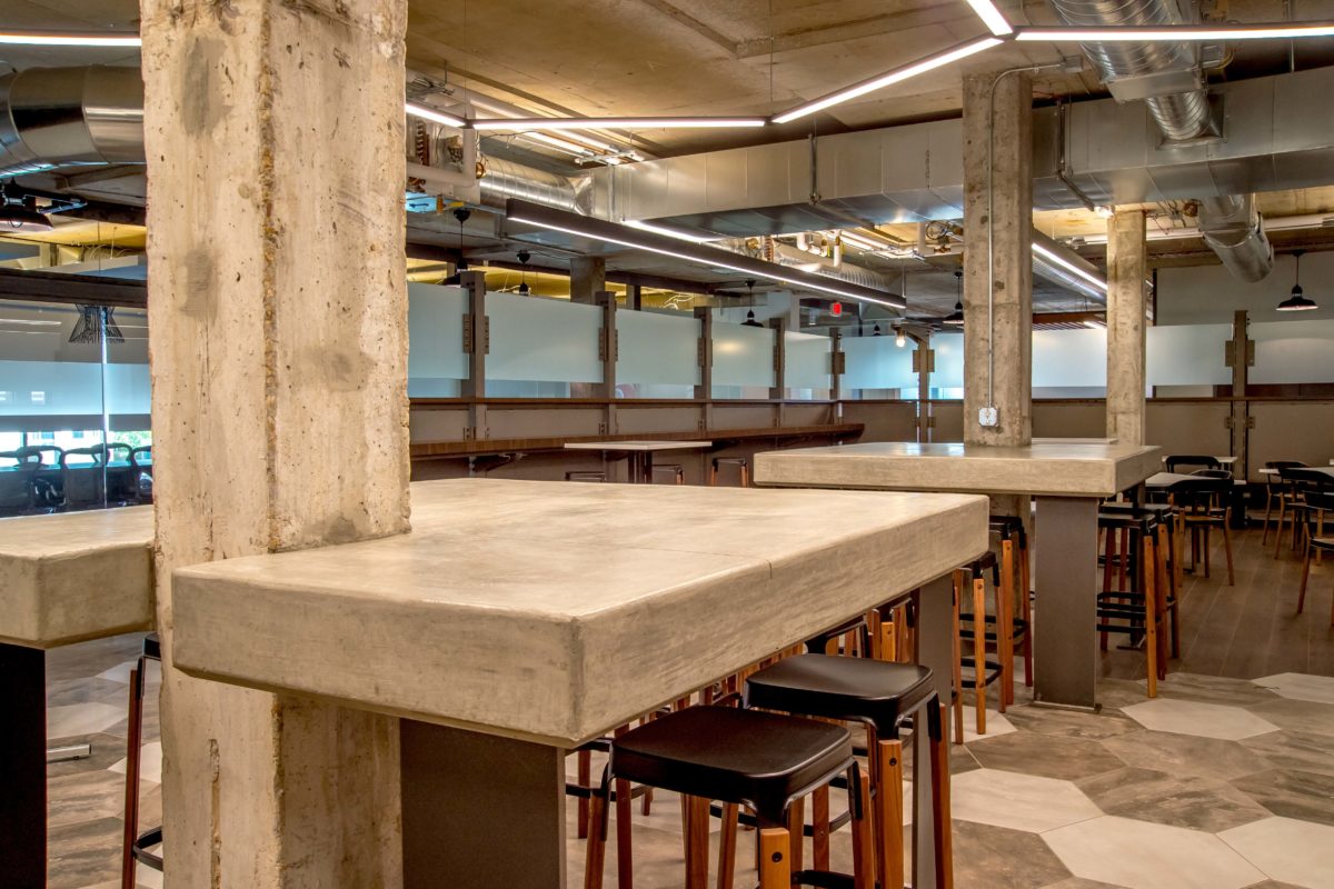
KAI and the client collaborated on the design of a 25-foot-long, nearly-5,000-pound trapezoidal-shaped conference room table made of steel with wood trim, a steel and concrete prep table weighing over three tons, steel partitions around the perimeter of the break room and concrete-top, bar-height tables, wrapping existing columns in the break room; all of which were custom built by Hillsdale Fabricators. Due to the weight and size of the custom furniture, cranes had to be used to place the pieces in their new spaces.
“It was important to show how these elements were constructed, so the joinery and details are purposely exposed,” said Perez. “This allowed the client to showcase the kind of specialized work they do.”
A random mix of light, medium and dark-gray, large format hexagon-shaped floor tiles (21″ x 24″) by Ottomo Ceramics were installed in the break room. Wood flooring was also used in the break room meticulously forming a flush, seamless transition to the edge of the hexagon-shaped floor tile to create an irregular edge design.
The centralized break room is defined by steel partitions with opaque glass above. Butcher block walnut wood benching, wood top tables and a standing height wood ledge along the perimeter in the bistro were all designed to accommodate varying sit and stand postures of users in the space.
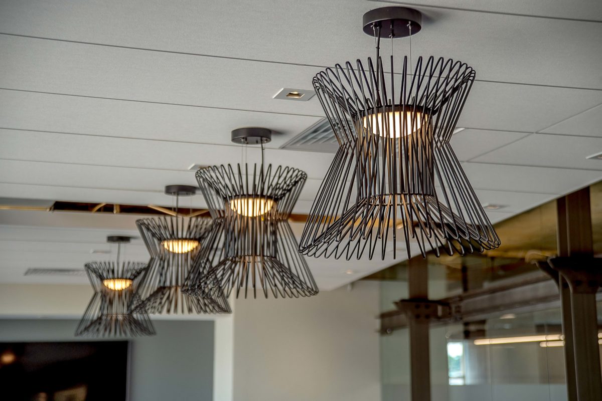
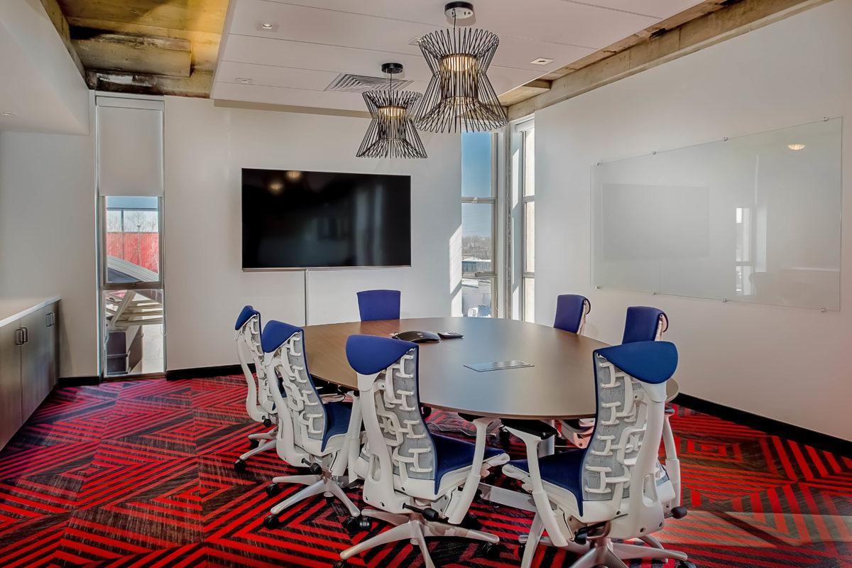
KAI worked closely with Lighting Associates to find linear and large hexagon-shaped light fixtures that mimic the layout and floor pattern in the break room. Energy efficient light fixtures that incorporate down- and up-lighting were specified to brighten the existing, dark, exposed concrete ceilings. These types of fixtures were used throughout the interior, including the conference rooms, which also feature industrial, black metal pendant light fixtures.
Acoustics was another important design element, considering the hard surfaces throughout the space. KAI created white noise with speakers in the ceilings, dropped acoustical ceiling tiles in the conference rooms, and carpet in the open office and workstation areas and conference rooms.
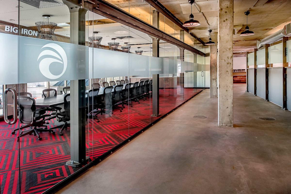
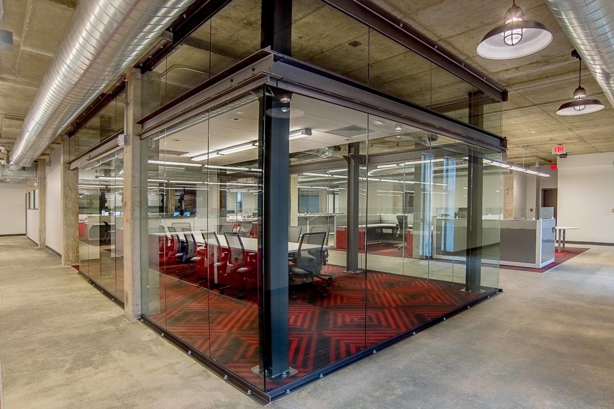
In keeping with the Alberici brand, red was tastefully used in the design, but not overdone. Carpet used in the open office areas and conference rooms was selected from Mohawk Group’s Street Thread collection, which features bold red, black and gray geometric patterns. Carpet used in the reception area was a mix of Merge, Intertwine and Magnify from Mannington. Red and gray also highlight the workstation desk drawers.
The client wanted a bright, open office layout. KAI achieved this by furnishing the space with low partition Herman Miller Canvas workstations, integrating clear glass panels within the workstation partitions; conference rooms surrounded by butt glazed glass partitions and redesigning the space by eliminating the existing walls from the perimeter of the interior to allow in natural daylight.
KAI collaborated with New Paradigm Interiors to select furniture used throughout the interior:
Break room
Herman Miller Magis Steelwood chairs
Herman Miller Magis Steelwood stool, walnut with black frame
Magis Officina Fratino tables
Workstations
Herman Miller Canvas workstations
Task chairs
Herman Miller Embody chair
Conference room chairs
Herman Miller Aeron chair
Reception area
Eames chairs
KAI utilized BIM technology on the project to provide the client with an Enscape walk-through of the Revit model at the design development completion state. This ability to display the design through a virtual walk-through was key to achieving a quick review and approval of the design.

